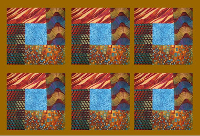
This is a pic of the finished block (I still cannot cut or sew fabric square/straight to save my life :P) It doesn't look too bad does it?

Now I need your opinion on what colour sashing to use. Sashing will go between and around the blocks like a frame. I also have to decide on a border colour as well - that is a strip of fabric that goes all the way around the framed blocks - I'll think about that later.
I used MS Word to create these graphics, so I was limited on my colour choices. Also my sample pics are 3 blocks by 2 blocks. The actual quilt will be lap size and 4x4 blocks for a total of 16 blocks.
Please let me know which you like best or suggest a completely different colour - I'm game.
Black (currently my fav)


6 comments:
I am so not creative in that way - sorry I can't be of help, but I like the last one you came up with!
O I love the colors! One looks better than the next. I do like the end one though, but think of the name you have given it!
Oh I didn't name it - that is what the block is called...Bright Hope.
I just think the black makes the other colours pop more...but still not 100% sure.
I think it depends on if you want your blocks to be the focus or for the entire quilt to blend together.
For me, the blocks are gorgeous and after all your hard work I would think you would want to highlight that.
If so, black is wonderful and the turquoise is wonderful. I don't care for the others.
Unless you want the quilt to blend - then the caramel would be your choice.
Because your blocks are so bold, I would suggest a pale blue.
The palest blue that is in your center blue block.
Then for the backing, I'd do a darker blue.
I would go with the black sashing...not sure about the yellow trim...maybe a blue to match the blue in the center?
Post a Comment